
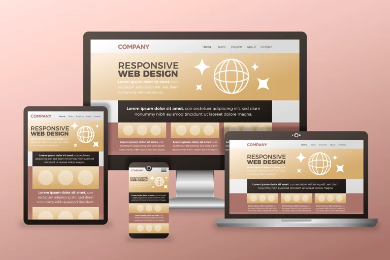
Learn Responsive Web Design and Techniques
Since responsive web design enables websites to adjust to different screen sizes and devices, it has become a crucial component of contemporary online development. To create web pages that provide the best possible user experience across various devices, it is essential to Learn Responsive Web Design
Learn Responsive Web Design
The process of developing flexible layouts and web pages that can adjust to the user’s screen size, platform, and orientation is known as responsive web design. Regardless of the device being used to visit the website, it strives to offer the best possible viewing experience, simple navigation, and seamless interactivity.
Definition of Responsive Web Design
A method of web design known as responsive web design ensures that websites display properly across a range of window or screen sizes and devices. By utilizing CSS media queries, flexible grids, and layouts to modify the design according to the user’s viewport size, it seeks to produce a fluid and consistent user experience.
Importance of Responsive Design
The capacity of responsive design to accommodate the various screen sizes and resolutions of contemporary devices, such as laptops, desktop computers, tablets, and smartphones, is crucial. It improves accessibility and user experience by making ensuring the website looks and performs as good as possible on all devices and viewport sizes.
Difference Between Adaptive and Responsive Design
Responsive design, which creates multiple fixed layout sizes based on certain devices, is sometimes contrasted with responsive design. On the other hand, responsive design dynamically modifies the layout and content according to the user’s screen size and capabilities using media queries and fluid grids.
Key CSS Techniques for Responsive Design
Responsive web design relies on key CSS techniques to ensure websites adapt to various screen sizes and devices.

Using Media Queries
Web developers can apply different styles depending on the features of the device displaying the information thanks to media queries in CSS. Developers may guarantee a consistent user experience across various screen sizes by utilizing media queries to create responsive designs that adapt to the screen width, height, resolution, and orientation of the device.
Implementing Responsive Images
For websites to provide the best possible visual experience, responsive images are essential. The implementation of responsive images—which adjust to the size and resolution of the user’s screen—by developers using HTML and CSS guarantees that images display correctly and preserve the overall design integrity on a range of devices and screen sizes.
Understanding CSS Flexbox and Grid
Web developers can easily construct flexible, grid-based designs with the help of CSS Flexbox and Grid, two extremely powerful layout tools. Through the application of these CSS techniques, developers may create layouts that are responsive, meaning that content is automatically rearranged and adjusted according to the available space, resulting in a visually pleasing and seamless user experience across a variety of screens and devices.
Best Practices for Learn Responsive Web Design

Responsive web design is essential for modern web development, enabling websites to adapt to various screen sizes and devices. It ensures an optimal viewing experience and seamless interaction across different platforms.
Optimizing for Different Screen Resolutions
It’s important to take into account the variety of devices and their capabilities while optimizing for different screen resolutions. Web designers may create designs that adapt to screen sizes and provide a consistent user experience by using CSS media queries and flexible grids.
Creating a Flexible Layout with CSS
Using CSS flexbox and grid to create responsive designs is one way to create a flexible layout with CSS. With the help of these technologies, web developers may design layouts that adapt dynamically to different screen resolutions by rearranging and adjusting information according to available space.
Approach to Responsive Web Design
Using essential CSS techniques, such as media queries and responsive images, is part of the responsive web design approach, which makes sure webpages adjust to various screen sizes and devices. This method seeks to produce aesthetically pleasing and fluid designs that work well on a variety of devices, offering the best possible user experience.
Advanced Tips and Tricks

It’s important to investigate more complex tips and tactics that can improve your design skills as you learn CSS for flexible web design. These insightful tips will help you make your websites responsive to different screen sizes and guarantee a smooth user experience.
Optimizing for Various Devices with CSS
CSS is essential for maintaining a unified and aesthetically pleasing design across a range of screen sizes and resolutions when optimizing for many devices. Web developers may create responsive designs that adjust to a wide range of devices, including smartphones, tablets, and desktop computers, by utilizing CSS media queries, flexible grids, and layouts. This strategy improves accessibility and user engagement by making sure the website looks and works great across all devices. It also improves the user experience overall.
Implementing HTML and CSS for Responsive Websites
Using essential strategies like media queries, responsive images, and CSS flexbox to build flexible and eye-catching designs is part of implementing HTML and CSS for responsive websites. Web developers may guarantee that the website adapts to different screen sizes and user interactions by using these HTML and CSS best practices, which will eventually improve user happiness and retention. With this all-encompassing approach to adaptable design, websites can provide a smooth surfing experience across a variety of platforms and devices.
Mastering CSS Code and Learn Responsive Web Design
Web designers must concentrate on developing responsive layouts, optimizing font sizes, and properly aligning elements across various screen sizes in order to grasp CSS code for responsive design. The responsiveness of websites may be improved by designers by utilizing CSS techniques like media queries, grid systems, and adaptable layouts. This ensures that users will have a visually appealing and engaging experience. Furthermore, CSS may be used to create responsive and user-friendly web layouts even more effectively if mobile-first design principles and a user-centric approach are prioritized.
FAQs
What is responsive web design, and why is it important?
Responsive web design is an approach that ensures a website’s layout and elements adapt to different screen sizes and devices. It’s crucial for providing a seamless user experience across a variety of devices, including desktops, tablets, and smartphones.
Can anyone learn responsive web design, regardless of their technical background?
Absolutely. Responsive web design concepts are accessible to individuals with varying levels of technical expertise. Many resources cater to beginners, providing step-by-step guidance in understanding and implementing responsive design principles.
What are the key principles of responsive web design?
Key principles include fluid grids, flexible images, and media queries. Fluid grids enable layouts to adjust based on screen size, flexible images scale accordingly, and media queries apply specific styles based on device characteristics.
How long does it take to learn responsive web design?
The learning duration varies based on individual background and learning pace. Beginners may grasp the basics in a few weeks, while gaining proficiency and mastery might take several months with consistent practice and real-world application.
Conclusion
These FAQs explained why it’s important and how you can learn it, even if you’re just starting. Think of it as a superpower that lets you create websites that adjust and look great on all kinds of screens. So, whether you’re new to web development or a pro, embracing responsive design is like having a secret weapon to make your websites stand out in the ever-changing digital world.
You are truly an accomplished webmaster. The launching speed of your website is remarkable; it almost seems as though you’re performing some sort of magic. Furthermore, the contents are flawless; you’ve done an excellent job with this subject.
This post is so informative. I’m glad I read it.